To ensure the best possible viewing across all devices, responsive Joomla51 template include a touch friendly mobile version of the top main navigation. This menu is displayed once your site is viewed on a small screen device in place of the standard menu seen on a desktop computer. In the mobile version of the menu, if your main navigation includes sub menu items, these items are indicated by an arrow next to the parent of the sub menu items. Clicking the parent item will then open a dropdown containing the sub menu items. This is a suitable solution as long as the parent item is not a link itself. In the following steps we will detail how to amend your template to allow the parent item text to be clickable which touching the remainder of the button will open the sub menu items dropdown.
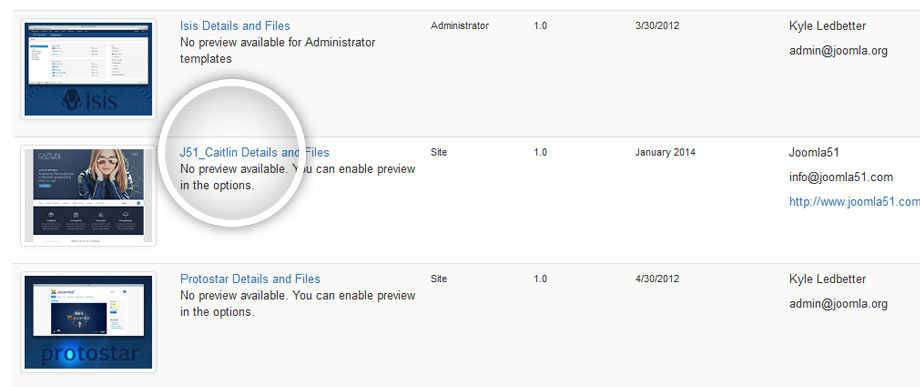
- From your Joomla administration navigate to Extensions -> Templates -> Templates -> J51_Template Details and Files

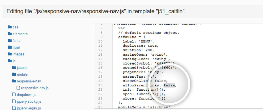
- In the template folder tree navigate to ../js/responsive-nav/responsive-nav.js. For more recent template releases this file has been renamed and moved to ../js/jquery.slicknav.js. If your template contains a ../js/jquery.slicknav.min.js then it is advised to copy the contents of your edited ../js/jquery.slicknav.js to the min file.

- Locate the following line (approx. line 20)..
allowParentLinks: false,
And set to true..allowParentLinks: true,
- Hit 'Save & Close'
The parent menu item text should now be clickable while touching the remainder of the button will open the dropdown containing the sub menu items.
