Due to the 'small' nature of smaller screens (mobiles, tablets, etc), you will often find yourself wanting to hide certain modules on these devices. Most likely you will consider these modules of lesser importance and wish to avoid users having to scroll down lengthy pages of content before reaching the area you deem relevant. Alternatively you may wish to replace a module with a different module whose content is more suitable for the smaller screen device (We will be detailing how to display a module on mobile devices while hiding it on a large screen devices in another tutorial). Thankfully since the introduction of Bootstrap in to Joomla this is now a super easy thing to do as Bootstrap includes some classes for this very purpose.
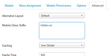
 Adding these classes to your modules can be done via the 'Module Class Suffix' field available within your Joomla module settings. Whatever you add to this field will add that class name(s) to the surrounding div of your module, therefore applying the properties of that class to your entire module. Simply navigate to your Module Manager (Extensions -> Module Manager) and click in to your module. Once in your module settings, select the 'Advanced' tab. You can then add the relevant classes to the 'Module Class Suffix' field depending on how you wish to display the module on each screen size.
The Bootstrap responsive utility classes you will be using are as follows...
Extra small devices Phones (less than 768px)
hidden-phone
Small devices Tablets (≥768px)
hidden-tablet
Medium devices Desktops (≥992px)
hidden-desktop
Note that depending on your Joomla template, you may need to add a space just before the first class in the field for it to function correctly.
Click 'Save' and that's it. All pretty simple really. You can now test your class by refreshing your page and resizing your browser window down to the necessary screen size or opening up your page on the corresponding device.
