Hi Ciaran,
I (layperson) have found the tutorials and forum all very helpful and have fixed loads of problems already, but have a few things to resolve still.
Please could you help me with the following:
1. How can I change the “Article title” appearance so that it matches the formatting of the module titles (which are a different font and have the red line under them)?
2. Re. the image hover module, I have set the number of columns to 1 for mobile (portrait), but I get two columns, which means the text on hovering does not fit the space. Any ideas?
3. Re. the next/previous arrows in the layer slideshow, as well as submenu arrows of the hornav menu – these are not showing in some instances. I first thought this was to do with small screen size or IE but have had the same fault on a widescreen using Firefox (when using Firefox on a 4:3 screen it shows them). Why does this happen/is there a fix for that?
Re. the Carousel Module:
1. I have managed to change the background colour and wondered if it is possible to change the colour of the module content area (which is grey)?
2. Also regarding the carousel, I have used a table with a pic in the left column, text in the right (see the casestudies page). The module width for top-1c is set to 100%. Even so the module displays at a narrower size on mobiles – can this be fixed?
3. Re. the table inside carousel: it would be good to be able to show first the left, then the right column on a mobile (portrait) screen. I could not get the code for a responsive table to work. I also tried text wrapping (instead of a table) without success. Any suggestions?
Kind regards, Sylvia
-
Greenstuff

-
- Commercial Templates
- Thursday, 31 January 2019
- Subscribe via email

Hi Sylvia
1. Would you have a URL to an example of your article title? You appear to have them largely disabled across your site, instead using a H! tag in your article body?
2. To amend you can add the following to the Custom CSS field of your templates parameters (Extensions -> Templates -> [YourTemplateStyle] -> Custom CSS)....
3. We appear to be unable to replicate this issue. Is the issue present on all browser or just with Edge?
Carousel
1. To amend (homepage carousel) you can add the following to the Custom CSS field of your templates parameters (Extensions -> Templates -> [YourTemplateStyle] -> Custom CSS)....
Edit to taste.
2. / 3. Are you tied to using a table in this module? The problem with tables is that they are largely unresponsive with very little scope for a workaround.
Ciaran
1. Would you have a URL to an example of your article title? You appear to have them largely disabled across your site, instead using a H! tag in your article body?
2. To amend you can add the following to the Custom CSS field of your templates parameters (Extensions -> Templates -> [YourTemplateStyle] -> Custom CSS)....
@media only screen and (max-width: 440px) {

.j51imagehover .j51imghvr-item {

    max-width: 100% !important;

}}
3. We appear to be unable to replicate this issue. Is the issue present on all browser or just with Edge?
Carousel
1. To amend (homepage carousel) you can add the following to the Custom CSS field of your templates parameters (Extensions -> Templates -> [YourTemplateStyle] -> Custom CSS)....
Edit to taste.
#owl-carousel99 .item {

    background: #999999;

}
2. / 3. Are you tied to using a table in this module? The problem with tables is that they are largely unresponsive with very little scope for a workaround.
Ciaran
- more than a month ago
- Commercial Templates
- # 1
Hi Ciaran,
Re. 1. Article titles: yes I have mostly disabled them, using the preferred module titles instead. They are visible in the “about” pages, such as here. I didn’t change the original template formatting as far as I can remember.
2. Thanks this has fixed the columns problem. I’ve noticed though the hover text only appears when clicking on the link, rather than when hovering (on an android mobile).
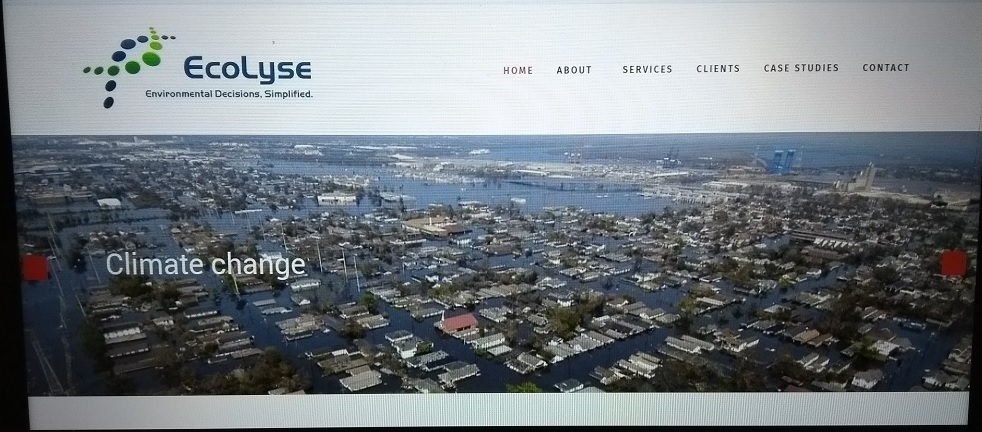
3. The missing slideshow & submenu arrows – I’m attaching a screenshot using Opera on a tablet, though this happens e.g. with Firefox on an android mobile and Internet Explorer on desktop as well. It’s fine with Edge, Vivaldi on a desktop; Firefox bizarrely displays them on one desktop but not another.
Re. the carousel module:
1. Changing the text container colour – I inserted the custom CSS as per your suggestion, but am afraid it did not work.
2. Carousel Module width issue and
3. image before text on narrow screen: we’re not wedded to the table, anything that looks tidy and achieves a similar result is fine.
Re. 1. Article titles: yes I have mostly disabled them, using the preferred module titles instead. They are visible in the “about” pages, such as here. I didn’t change the original template formatting as far as I can remember.
2. Thanks this has fixed the columns problem. I’ve noticed though the hover text only appears when clicking on the link, rather than when hovering (on an android mobile).
3. The missing slideshow & submenu arrows – I’m attaching a screenshot using Opera on a tablet, though this happens e.g. with Firefox on an android mobile and Internet Explorer on desktop as well. It’s fine with Edge, Vivaldi on a desktop; Firefox bizarrely displays them on one desktop but not another.
Re. the carousel module:
1. Changing the text container colour – I inserted the custom CSS as per your suggestion, but am afraid it did not work.
2. Carousel Module width issue and
3. image before text on narrow screen: we’re not wedded to the table, anything that looks tidy and achieves a similar result is fine.
Attachments (1)
- more than a month ago
- Commercial Templates
- # 2
Hello
1. To amend you can add the following to the Custom CSS field of your templates parameters (Extensions -> Templates -> [YourTemplateStyle] -> Custom CSS)....
2. As there is no hover state on mobile devices, I am sorry to say there is no solution to this issue.
3. To amend you can add the following to the Head Custom Code field of your templates parameters (Extensions -> Templates -> [YourTemplateStyle] -> Custom Code)....
1. I am unable to see the suggested CSS in your source. Can you confirm that you have added it to the correct template style and field?
Ciaran
1. To amend you can add the following to the Custom CSS field of your templates parameters (Extensions -> Templates -> [YourTemplateStyle] -> Custom CSS)....
.item-title h2,

.page-header h2 {

    font-size: 1.6rem;

}

.item-title h2:after,

.page-header h2:after {

    content: '';

	background-color: red;

	height: 3px;

	width: 70px;

	display: block;

	margin: 10px 0;

}
2. As there is no hover state on mobile devices, I am sorry to say there is no solution to this issue.
3. To amend you can add the following to the Head Custom Code field of your templates parameters (Extensions -> Templates -> [YourTemplateStyle] -> Custom Code)....
<link href="https://stackpath.bootstrapcdn.com/font-awesome/4.7.0/css/font-awesome.min.css" rel="stylesheet" integrity="sha384-wvfXpqpZZVQGK6TAh5PVlGOfQNHSoD2xbE+QkPxCAFlNEevoEH3Sl0sibVcOQVnN" crossorigin="anonymous">1. I am unable to see the suggested CSS in your source. Can you confirm that you have added it to the correct template style and field?
Ciaran
- more than a month ago
- Commercial Templates
- # 3
Hi Ciaran,
A final update on this thread - thanks for all your super support.
I managed to fix the things you commented on and have today also found a solution to question2 re. the carousel module (having the image on the left rather than the top of the carousel container, with text to the side rather than underneath).
I added <img class="pull-left" /> and some margins to the html for the respective module image, and the following code to the custome CSS:
.projects #owl-carousel88 .owl-item img {
display: block;
width: 34%;
max-width: 100%;
vertical-align: left;
}
where "projects" is the module class suffix. Seems to work!
Thanks again,
Sylvia
- more than a month ago
- Commercial Templates
- # 4
- Page :
- 1
There are no replies made for this post yet.
Be one of the first to reply to this post!
Be one of the first to reply to this post!
Please login to post a reply
You will need to be logged in to be able to post a reply. Login using the form on the right or register an account if you are new here. Register Here »