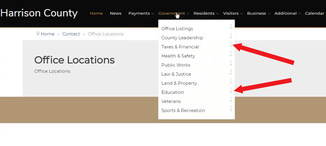
I'm working with a submenu on the Natalie template and need to check on the look of the dropdown submenu navigation icons. Please see the menu in the image. Is this the way the icons for showing a subcategory is supposed to look? To me, it looks like the little square is what you see when you don't see an icon.
I didn't see this sub-navigation in the template demo so wasn't sure if it is supposed to look that way.

Thanks in advance
Dan