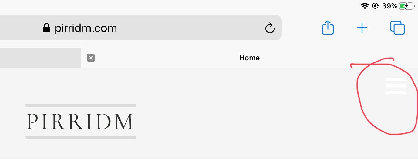
Could you please confirm that the menu should be showing up as a hamburger on the iPad. If it is, when how do I change the colour of the hamburger so that it isn't hidden?
-
fballem

-

- Commercial Templates
- Thursday, 11 June 2020
- Subscribe via email
I asked my brother to have a look at my website, which is using the Kinvara template. He was using an iPad and sent back the feedback that I might want to change the colour of the hamburger menu on the upper-right. Since I don't see the hamburger menu on my 4K display, I asked him what he was talking about. He sent back the attached image.
Could you please confirm that the menu should be showing up as a hamburger on the iPad. If it is, when how do I change the colour of the hamburger so that it isn't hidden?
Could you please confirm that the menu should be showing up as a hamburger on the iPad. If it is, when how do I change the colour of the hamburger so that it isn't hidden?

- Page :
- 1
There are no replies made for this post yet.
Be one of the first to reply to this post!
Be one of the first to reply to this post!