I am reworking a site to migrate to j4 and am using the Emani template.
All working pretty well except the logo and the menu are not centering on the page. I have tried several things and no luck.
Also, after adding space at the top of the page, the "back to top" link is not going to the very top.
Thanks,
Pappy
-
Pappy

-

- Commercial Templates
- Friday, 26 January 2024
- Subscribe via email
Looking at the Emani demo, the menu is not working correctly either. It is running off the page on my Ipad and makes the page extend off the viewport.
Thought I had a margin or flex error, which is why I posted, but it looks like it is in the template?
Finding other errors too,
Any help?
Thought I had a margin or flex error, which is why I posted, but it looks like it is in the template?
Finding other errors too,
Any help?
- more than a month ago
- Commercial Templates
- # 1

Hi Pappy
It seems that some sub menu items render outside the viewport hence the scroll bar. Have you considered increasing the viewport width in the General -> Responsive Options -> Mobile Menu Breakpoint option of your template style settings. This will allow tablet devices to display the mobile menu which is better suited for touch devices.
Ciaran
- more than a month ago
- Commercial Templates
- # 2
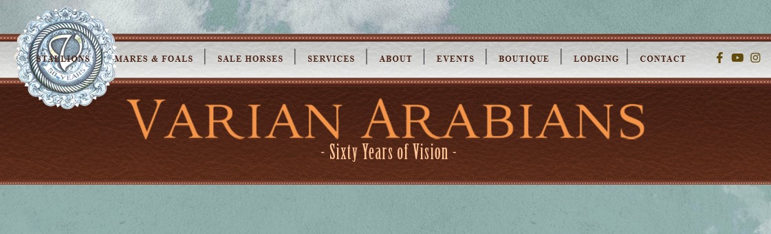
The menu is part of the design, like your demo, on the same devices.
I've removed images from my dropdown menus and reworked the css for the container_header which seems to have fixed part of the problem.
The logo and hornav are still not centering on the page.
Thanks,
Pappy
I've removed images from my dropdown menus and reworked the css for the container_header which seems to have fixed part of the problem.
The logo and hornav are still not centering on the page.
Thanks,
Pappy
- more than a month ago
- Commercial Templates
- # 3
Forgot to add that the social section is included also, but removing it makes no difference. It is still not centering on the page.
- more than a month ago
- Commercial Templates
- # 4
Hi Pappy
Presuming I understand you correctly, to amend try adding the following to the Custom CSS field of your templates parameters (Extensions -> Templates -> [YourTemplateStyle] -> Custom CSS)....
Ciaran
Presuming I understand you correctly, to amend try adding the following to the Custom CSS field of your templates parameters (Extensions -> Templates -> [YourTemplateStyle] -> Custom CSS)....
.header_main {

    margin-right: 290px;

}
Ciaran
- more than a month ago
- Commercial Templates
- # 5
I was looking at the header_main, but like your fix, it just moves the menu. It only looks good at one size.
Reduce the width of the window and it runs off the left now.
It is not centering over the content.
Mark
Reduce the width of the window and it runs off the left now.
It is not centering over the content.
Mark
- more than a month ago
- Commercial Templates
- # 6
Hi Mark
Maybe try something like this. You may need to edit this slightly...
You may also need to increase the breakpoint width.
Ciaran
Maybe try something like this. You may need to edit this slightly...
#header_main {

    width: 1400px;

}

.hornav {

    margin-right: 90px;

}

#socialmedia {

    right: 80px;

}
You may also need to increase the breakpoint width.
Ciaran
- more than a month ago
- Commercial Templates
- # 7
Still not right and it does not seem correct to make an element larger than the template width.
It looks "okay" using computer and Chrome/Firefox/Safari, but the layout is messed up on Ipad using Chrome (Firefox and Safari play nicer).
I"ve tweaked as much as I can, with no luck, so I put a bg color behind Logo and Hornav.
The graphic, taken from Ipad using Chrome, shows the logo spacing is overlapping the hornav. Also the template is not filling width of the screen.
The Flex code for the logo seems to be the issue.
This is what is causing everything to move right and guessing the issue with Chrome.
Attachments (1)
- more than a month ago
- Commercial Templates
- # 8
Hello
A bit of a shot in the dark this but those adding the following help?...
Does increasing the mobile breakpoint even further resolve the issue in any way?
Ciaran
A bit of a shot in the dark this but those adding the following help?...
.outside_header {

    overflow: hidden;

}
Does increasing the mobile breakpoint even further resolve the issue in any way?
Ciaran
- more than a month ago
- Commercial Templates
- # 9
adding .outside_header css makes the social icons disappear.
I don’t want the mobile break point higher. There is enough room on the page for the logo, menu and social icons.
Is there a way to replace the Flex menu? A lot of people use Chrome and Ipads.
I don’t want the mobile break point higher. There is enough room on the page for the logo, menu and social icons.
Is there a way to replace the Flex menu? A lot of people use Chrome and Ipads.
- more than a month ago
- Commercial Templates
- # 10
Hi Pappy
May I suggest sending temporary administration access to your Joomla installation to [email protected] and we will examine this issue further. For our reference please paste a link to this post in your email.
Ciaran
May I suggest sending temporary administration access to your Joomla installation to [email protected] and we will examine this issue further. For our reference please paste a link to this post in your email.
Ciaran
- more than a month ago
- Commercial Templates
- # 11
I sent email with info on the 17th.
Here is a screen capture of your demo using Ipad/Chrome. The menu runs off the page too, but your computer/responsive image in the page looks fine...
Here is a screen capture of your demo using Ipad/Chrome. The menu runs off the page too, but your computer/responsive image in the page looks fine...
Attachments (1)
- more than a month ago
- Commercial Templates
- # 12
Hello
Thank you for reporting the issue on the template demo. I have increased the breakpoint for the mobile menu.
Following is a screenshot from your site at 1120px. As you can see, there is not enough room to accommodate both the logo, icons and menu and this width. Would you like me to provide CSS to make the desktop version of the menu take up less room?
Ciaran
- more than a month ago
- Commercial Templates
- # 13
You did not post the screenshot.
The desktop version looks fine in all browsers.
The logo, menu and icons have plenty of room on Ipad using Firefox and Safari - Landscape view
The issue is with Chrome and Ipad.
The desktop version looks fine in all browsers.
The logo, menu and icons have plenty of room on Ipad using Firefox and Safari - Landscape view
The issue is with Chrome and Ipad.
- more than a month ago
- Commercial Templates
- # 14
My apologies
Please find attached the screenshot as we see it...
Ciaran
Please find attached the screenshot as we see it...
Ciaran
Attachments (1)
- more than a month ago
- Commercial Templates
- # 15
I had the template width set to 1140 and you suggested making the header_main css 1400px wide.
Are we countering the responsive?
When I have the ipad portrait, the mobile menu shows correctly, turn Ipad landscape and hornav menu appears. Like it should.
When I have the ipad landscape, the hornav shows, turn the Ipad portrait and the hornav is still shown. You have to refresh the page to show the mobile menu.
The template or header is not responsive?
During development, I tried several ways to reduce menu space. Don’t know if it is flex related, but letter-spacing doesn’t make any difference.
Please provide some css to reduce space if possible?
- more than a month ago
- Commercial Templates
- # 16
Hello
To amend try adding the following to the Custom CSS field of your templates parameters (Extensions -> Templates -> [YourTemplateStyle] -> Custom CSS)....
Ciaran
To amend try adding the following to the Custom CSS field of your templates parameters (Extensions -> Templates -> [YourTemplateStyle] -> Custom CSS)....
.hornav ul.menu > li {

    margin-inline: 8px;

}

.hornav > ul > li::before {

    right: -10px;

    top: 13px;

}
Ciaran
- more than a month ago
- Commercial Templates
- # 17
I figured out the issue with the webpage not filling the window using chrome and Ipad.
Chrome is displaying the “mobile” version, which threw me off as it is showing the hornav menu.
The layout is correct and logo, menu and social all fit in the template area.
Click the 3 dots in Chrome to request “desktop” view. It fills screen and looks correct.
View port issue?
Chrome is displaying the “mobile” version, which threw me off as it is showing the hornav menu.
The layout is correct and logo, menu and social all fit in the template area.
Click the 3 dots in Chrome to request “desktop” view. It fills screen and looks correct.
View port issue?
- more than a month ago
- Commercial Templates
- # 18
- Page :
- 1
There are no replies made for this post yet.
Be one of the first to reply to this post!
Be one of the first to reply to this post!
Please login to post a reply
You will need to be logged in to be able to post a reply. Login using the form on the right or register an account if you are new here. Register Here »